Color Usage in Interior Spaces - Light and Texture

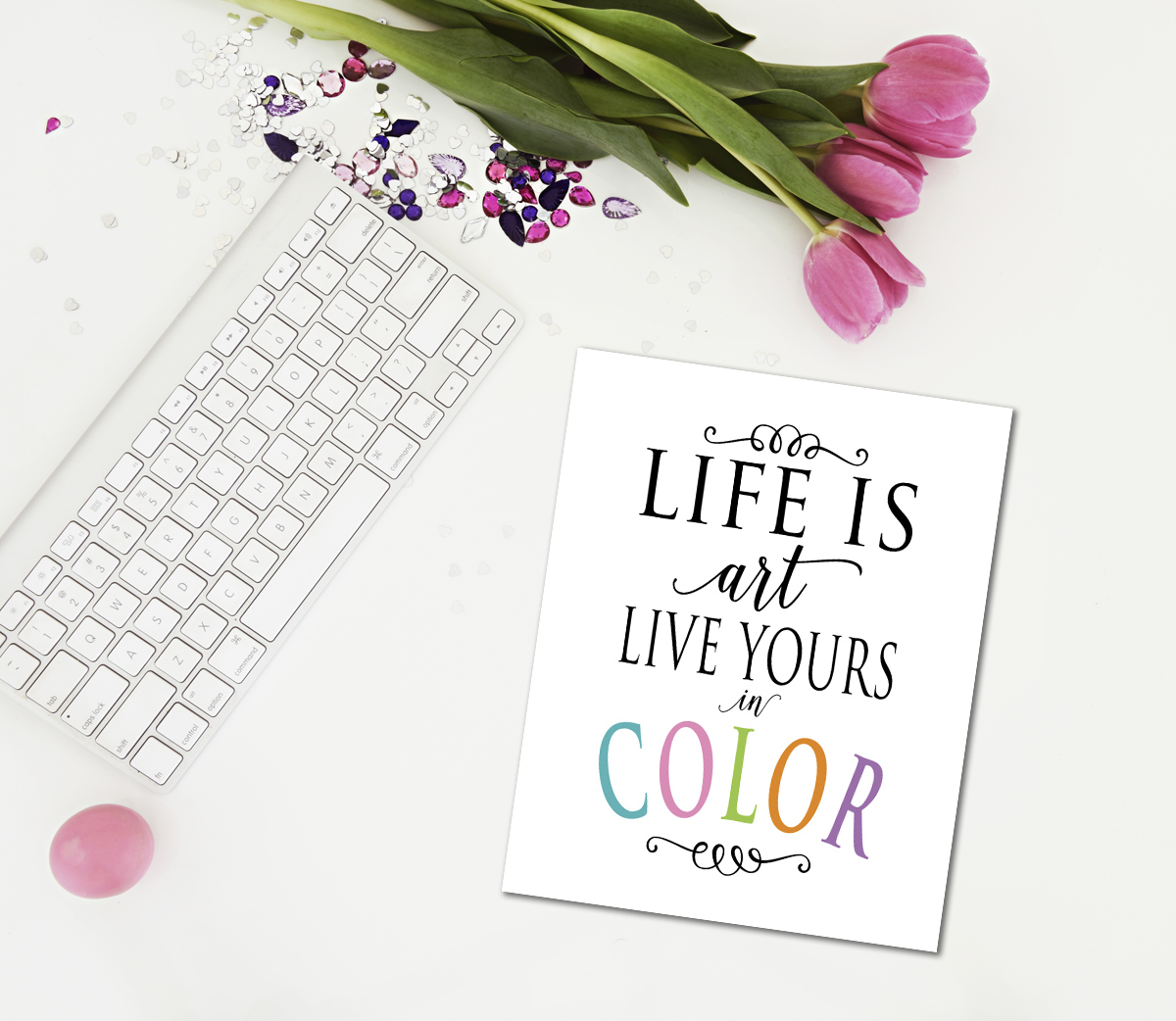
"Life is art, live yours in color."
Color is one of the most important elements in making a design successful. Often color is one of the hardest elements for designers and homeowners to put together. Instead of being afraid of color, try to understand color and what it means to us. By increasing our understanding of color, we are able to select and mix colors with confidence and efficiency. In the following discussion on color usage in interior spaces, we will discuss things that influence color, such as light, texture, and color placement; how color can affect the way we feel in a space and how the space is perceived; how space can be altered through color; and how color expresses personality.
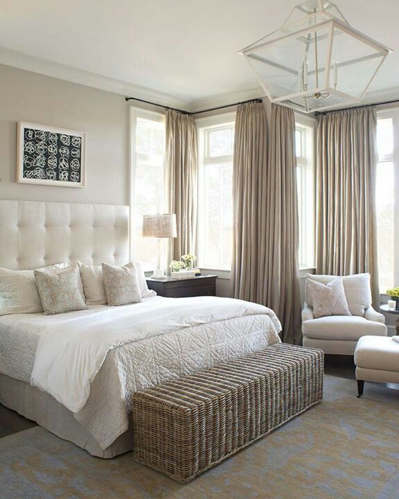
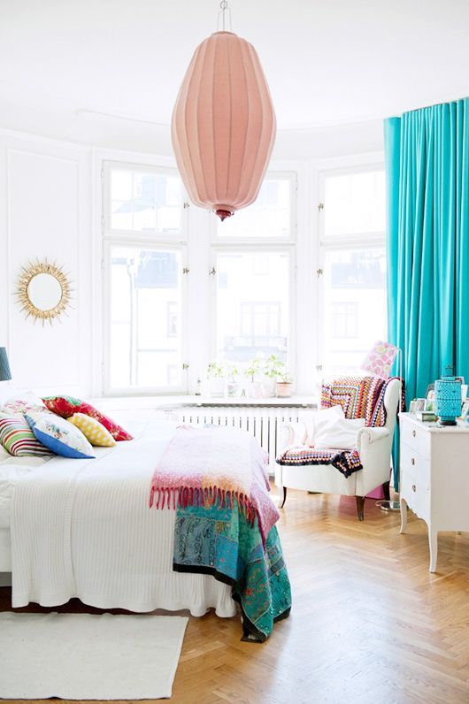
Light
The type of light we choose in a room will impact how the colors are perceived. Colors change under different light. That is why it is so important to consider what time of day you will be spending in the room. There are two different types of light: natural and artificial light. Direct sunlight is considered the ideal light source because it it’s the most evenly balanced light. Unfortunately this type of light is not consistent. It changes four times a day: sunrise, noon, afternoon, and dusk.
Orientation is another important consideration when choosing colors. If a room faces north, there will be little or no sunlight admitted and the room will be cold. Studies have shown that people will feel warmer in rooms colored in red or orange tones and cooler in rooms colored in blue or green tones. So choosing the correct colors can affect the comfort of the room’s inhabitants.


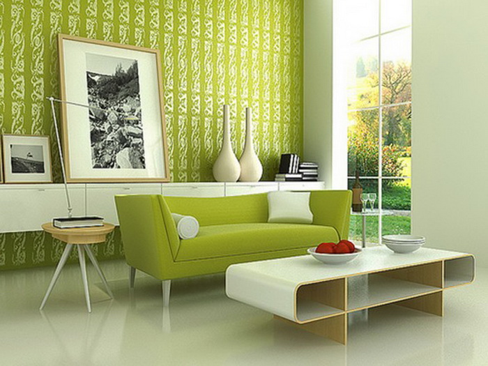
Texture
Texture affects how color is perceived. The same color can have a different appearance on carpet or fabric than it does on paint. The basic rule of thumb here is that the rougher the texture, the darker the color will appear. A smooth texture will appear lighter than a heavily textured fabric. A shiny surface will reflect light and make colors seem more intense, while matte surfaces will absorb light and make color seem paler .


As we have just considered, there are many things that go into choosing color, such as light and texture. Next time we'll talk about color placement and the size of the space.
Thanks for stopping by...
Until next time,