
Tips for Mixing Fonts

Selecting the right font (or typedface) to use in any design is an art. While there are no hard and fast rules there are suggestions or guidelines that will help in your selections. Before we start let’s define some terms.
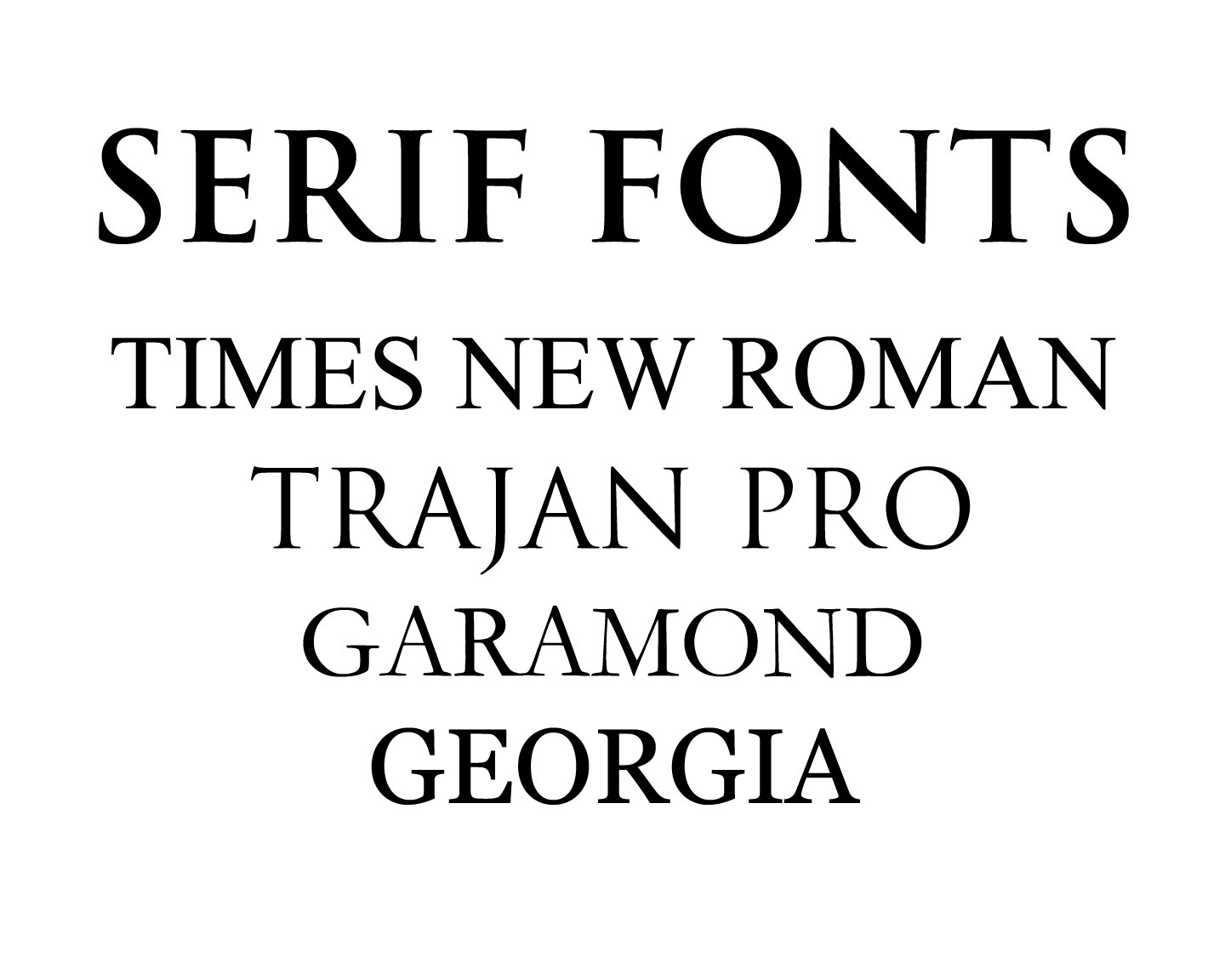
Serif vs. Sans Serif
In typography a serif is a small line or stroke finishing off a letter. Examples include Times New Roman, Trajan Pro, Garamond, and Georgia.
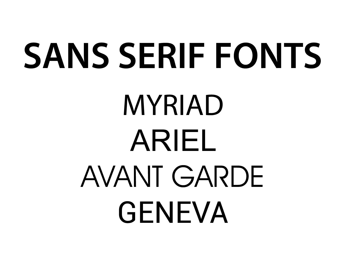
Sans Serif is the opposite, mainly a typeface without a serif. Examples include Myriad Pro, Ariel, and Roboto.
Formal vs. Casual Script Fonts
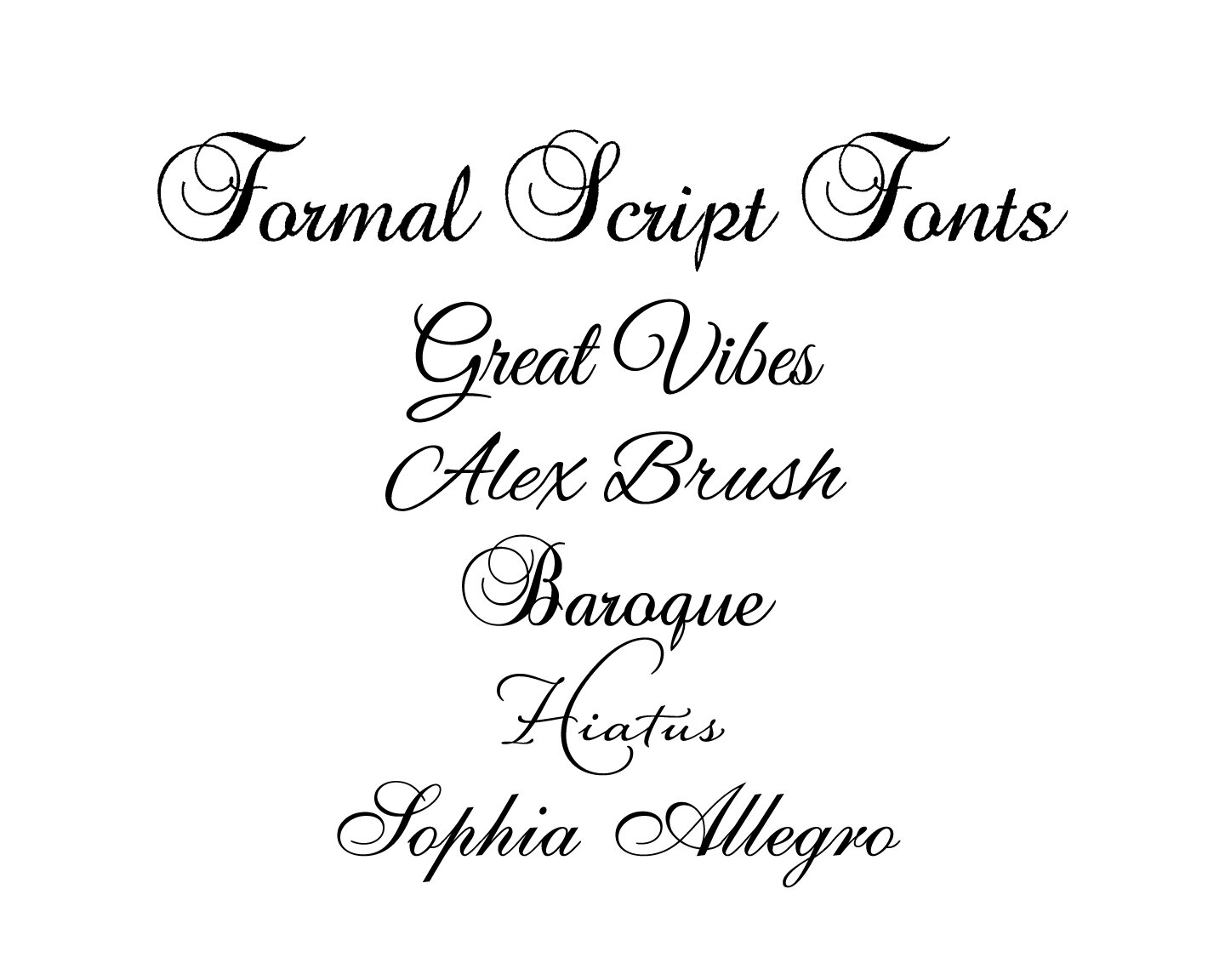
On the other side of the coin are script fonts. Script fonts can be classified as formal script and casual script. Formal Script fonts includes fonts such as Great Vibes, Alex Brush, Baroque, Hiatus, and Sophia Allegro.
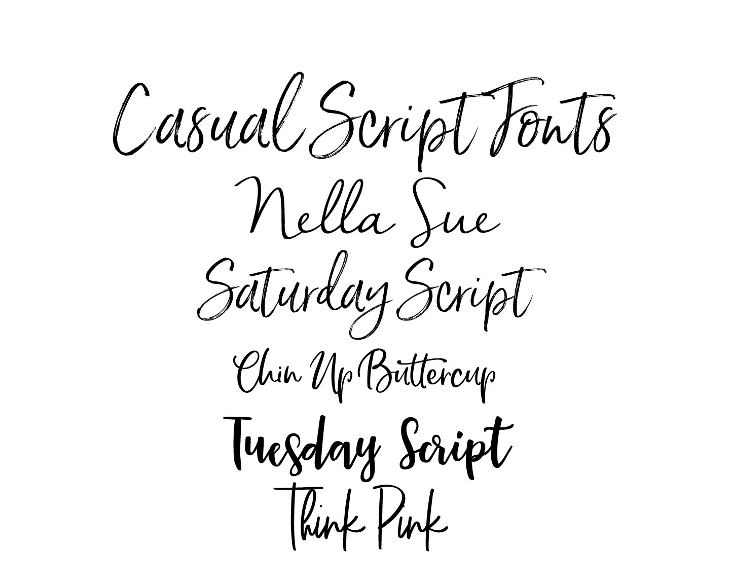
Casual Script fonts (also known as decorative and handwritten fonts) include fonts such as Nella Sue, Saturday Script, Chin Up Buttercup, Tuesday Script, and Think Pink.
Now that we understand the different types of fonts, how do we decide what goes with what?
The first rule or guideline to remember is “Less is More”; in other words, “Keep it Simple”!
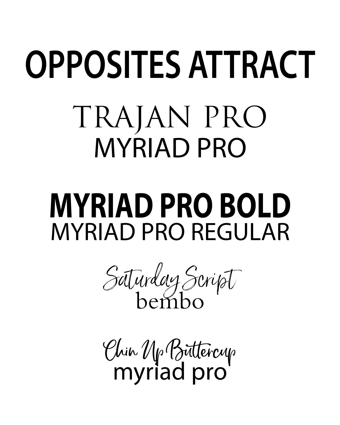
Opposites Attract: When mixing fonts choose fonts that complement each other. Most fonts have moods or personalities just like us - casual, playful, elegant. Mix a serif and a sans serif; a big fat font (or bold) with a skinny font, a fancy script with a simple serif or sans serif font. Avoid pairing fonts that are too similar. That is why most graphic designers don’t advise mixing two script fonts. They tend to compete with each other. Better to mix a script with a serif or sans serif.
Importance: Establish a visual hierarchy. Decide which words are the most important. Color along with font will be important. Brighter, bolder colors bring more attention; thus they are more important.
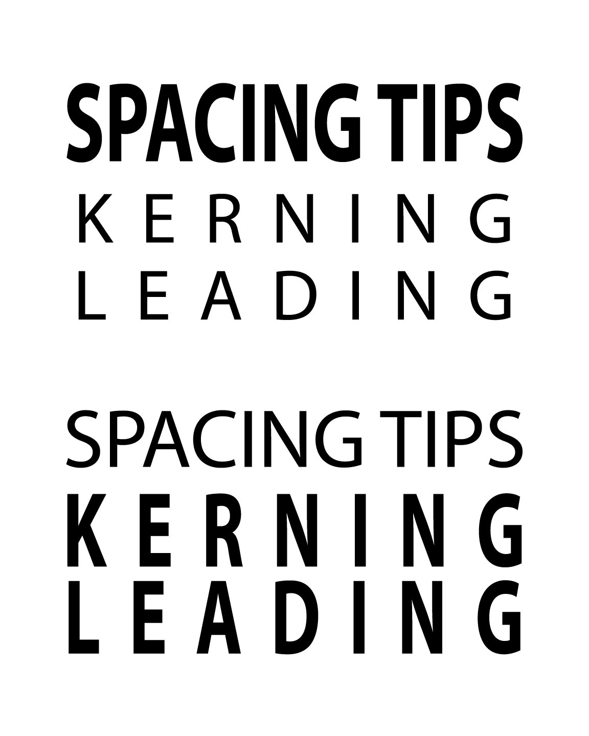
Spacing: Kerning and leading are technical terms that apply to how text is spaced. Kerning is the overall spacing between groups of letters; Leading is the vertical spacing between lines of type. When letters are improperly spaced, the look is ruined.
How many fonts? Limit the amount of fonts to two or three. Select one font for your main font and the other one or two as complements.
Trust your designer: There’s a lot more to combining fonts than was touched on here. It’s kind of like mixing patterns for an interior designer. It takes skill.

I hope this very brief article on mixing fonts has given you some insight on what goes into to selecting fonts. Once I find fonts that work, I tend to use them over and over because I know that they will look good.
Thanks for stopping by,
Until next time…
